Disclosure: Some links on this page below are affiliate links, meaning, at no additional cost to you, we will earn a commission if you click through and purchase. Read our disclosure for more info.
We have a basement nook right off of the utility area. Since moving in, it has ended up being a space that Cassie uses to do her sewing projects.
 Kamran 16 Dec 2020 • 17 min read
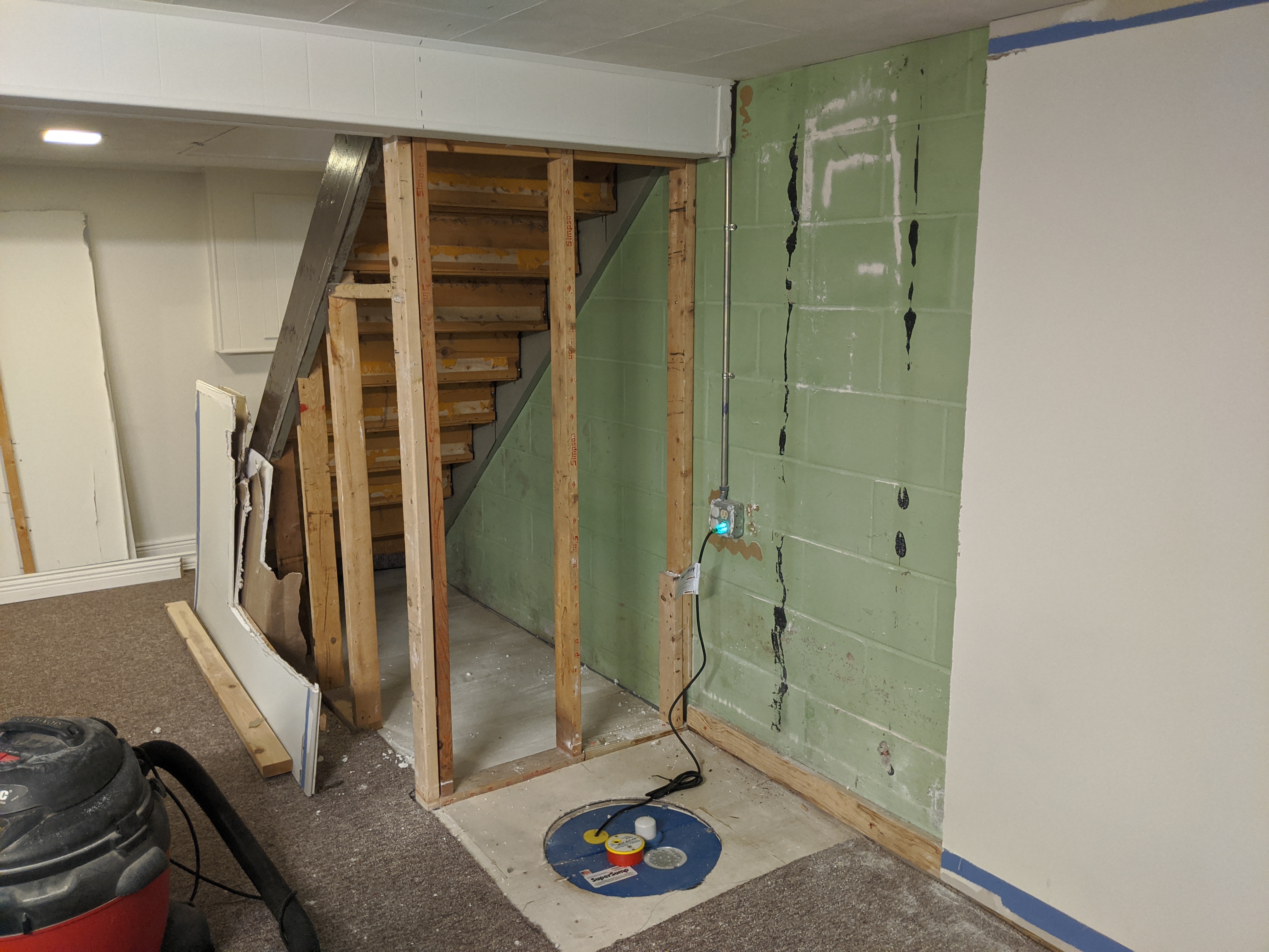
I hadn't planned to do another project so soon after the sump pump closet but we couldn't delay any longer, Cassie needed her own space.
The entire series is available here:
May we suggest an author? Cassie Kamran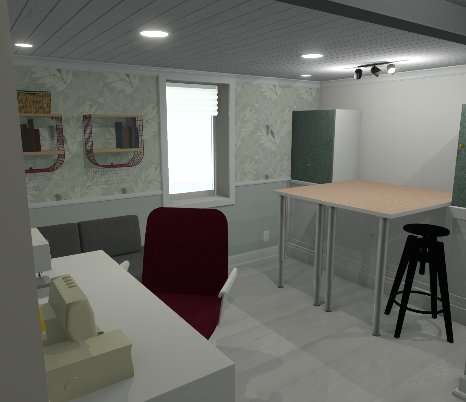
What we were starting with
As I worked on the last project Cassie's florescent light fixture stopped working. That was the least of the issues. Here is the before state:

As you can tell things were sub-optimal, as I like to say.
There is a single fluorescent light fixture in the room but it had died so there was no light anymore in the space. Since I wanted to experiment with replacing the floor in the basement, I decided this would be the first room we intentionally remodel top to bottom, to really make it special for Cassie (and for me to learn more skills).
It was time to do our first real design plan! What even is a design plan? Sounds fancy. I had (and continue to have?) no idea what I'm doing so let's get into it!
Where to start when planning a room?
When I started the sump pump closet I had not done much upfront mockup or design except graph paper sketches. For a whole room though, I wanted to act like Cassie was a client. To get in her head!
I am not a professional interior designer but I work with clients on my software projects. I believe a good designer (software or otherwise) will listen to what people are saying and understand what they need better than they do.
That's what I started with: listening.
What is the room's purpose?
The first thing me and Cassie did together was stand in her room and I had her tell me what she currently does. Based on that, we agreed that she needed a true "She Space." A workspace for sewing and projects. A space where she can do everything she needs and that has enough storage for all her fabrics, materials, and tools.
Since she's my wife I also knew that she had always wanted a reading nook so I wanted to try and work that in too (bonus husband points 😏).
What will be in the room?
Based on Cassie's needs I had a list of things that were "must-haves" in the room:
- A desk that can fit her serger and sewing machine (and laptop if needed)
- A comfy task chair
- A surface to cut fabric on that was large enough – table height and room to maneuver around
- Good task lighting overhead
- Medium- and long-term storage that can fit fabric, yarn, and other materials
- Easily accessible storage for plans, notes, etc.
For "nice-to-haves" I really wanted to work in a reading nook which meant some kind of chair or furniture to read on comfortably and storage for some books.
Have a budget, even if it's rough
This is an important room for Cassie but we knew we didn't want to overspend on furnishings which can easily spiral out of control. Having a budget will help reign in spending and it also ends up influencing the style like choosing to go with IKEA products vs. West Elm.
For our budget for this room we wanted to keep it under $3,500. We will see how we did at the end but I've been keeping track in a spreadsheet! By doing it ourselves, we save on floor installation, lighting and electrical, ceiling installation, and finishing. That is a HUGE advantage to DIY – costs that would have originally gone towards labor can be put back into mid- and high-range materials and it still saves money (if you choose!).
What's the style of the room?
This question will vary for everyone including the designer and the client. Personally, I really tend to like designs that feature natural textures like wood and greenery coupled with modern accents like matte black finishes. This could be considered "modern rustic" I guess!
Incorporate personality but keep it cohesive
Since this was Cassie's room I wanted to make sure I incorporated her personality without going too far off the road from what we hoped to do in the rest of the house. I sent her a bunch of Pinterest ideas and rooms for her to look over. She told me what she liked (clean, wall boards) and didn't like (open shelves).
It had helped that I've been playing around with potential kitchen mock-ups for the future (now won't that be a series to follow, eh?) so we had talked about style and designs we liked previously.
I tried aiming for a modern rustic look with some wood textures and I thought a wallpaper might look nice on the window wall.
Look for inspiration
I think professional designers will create a "mood board" out of physical materials and also show different designs to see likes/dislikes. We didn't go that far but I did copy and paste a lot of designs into our group chat and then rounded up the favorite "inspo pieces" into our Trello planning board.
Some sites we used for inspiration:
I keep a Google Photos album of designs I like for my own reference too.
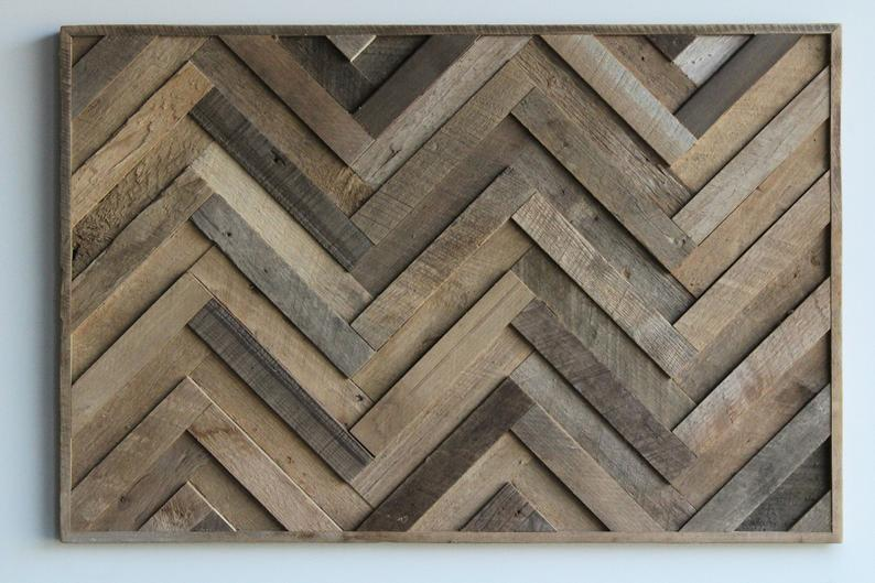
Here's some examples of images I used to showcase materials/textures/inspiration:


So in the end, it has some modern/mid-century modern elements, Bohemian touches like the wallpaper, and then the wood textures on the floor and ceiling we both love.
What if you don't have a design bone in your body?
Design is a skill, you're not born with it! Like anything, you might need to learn more about it and you don't need to become Joanna Gaines to start making simple designs that look good to you (get it?).
Maybe you watch a lot of HGTV? 🙋♂️Guilty! Those shows aren't meant to teach you interior design, they're designed to make you unhappy with what you have (oh, ouch). BUT I have found they helped me learn vocabulary and just get exposed to tons of designs in general. Fixer Upper and Property Brothers sometimes dive into designs into more detail, which is why they're my favs. Fixer Upper also has its Behind the Design off-shoot. I've paused shows before to take pictures on my phone for future reference.
If you've never tried designing a room yourself the way I approached it was by using some basic interior design principles around color, texture, and space planning. I highly recommend this YouTube series (from the BBC no less?) for some introduction material (which uses average houses as examples, not designer houses). I also did go ahead and buy Home Body too because I'm a dork.
Choosing building materials
While we looked at furnishings I also looked at different flooring and ceiling options. For a craft room, you don't want a carpet – it will collect serger threads, needles, and more, yuck! I knew that I wanted parts (not all) of the basement to have a luxury vinyl plank (LVP) floor because it is DIY-friendly, waterproof, and adds a great aesthetic. Since this room is detached it serves as a great test bed for what the rest of the basement could be like.
Since I follow Home Renovision, his LVP supplier affiliate is Decorner up in Canada. Jeff offers a discount so I went with them and had the flooring shipped down to the US. If you're curious what to look for in LVP flooring quality, I recommend watching this:
We ordered samples and Cassie chose the Cyrus Finely XL (wide plank) which we both loved:


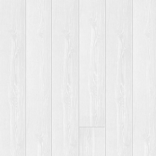
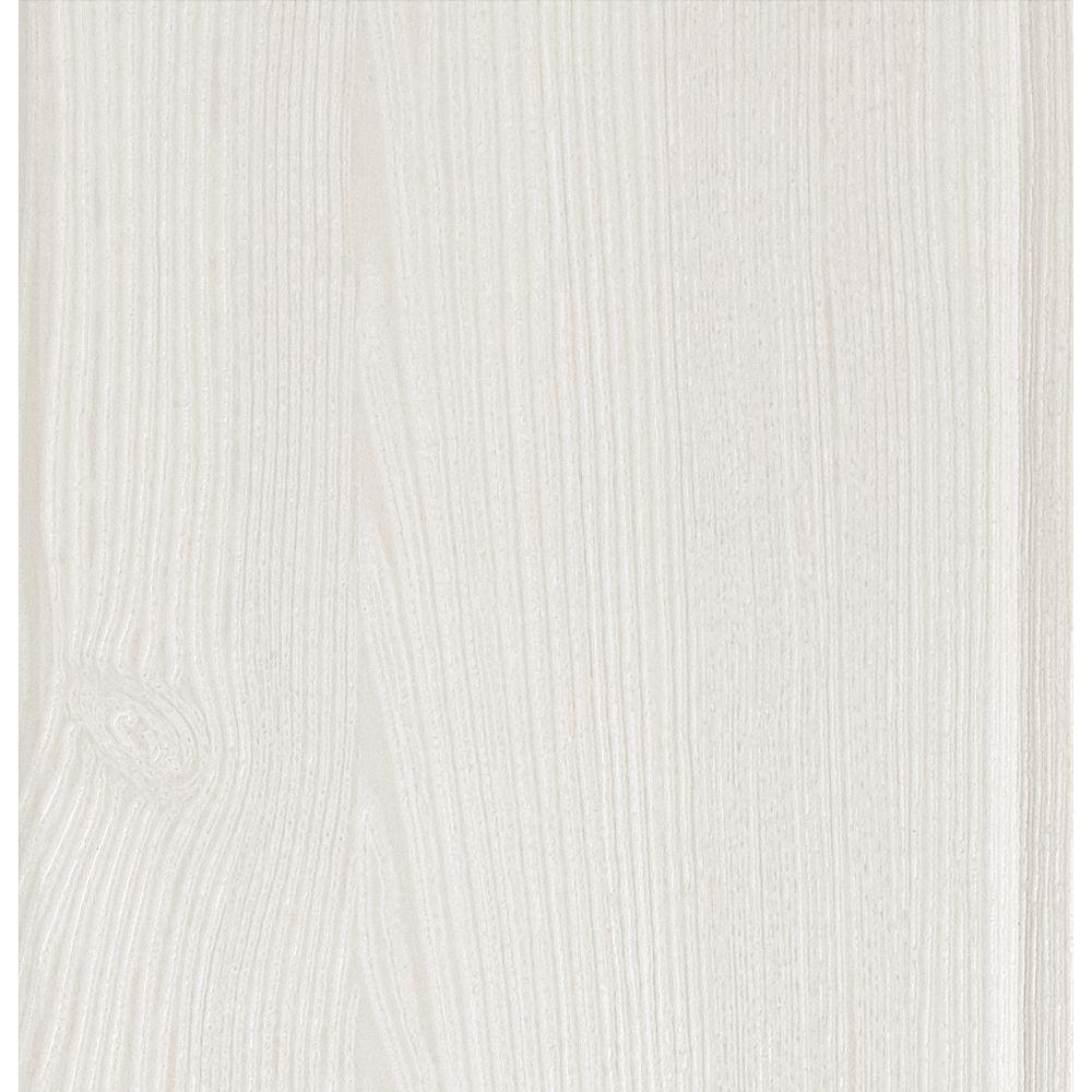
The ceiling was a different animal. I could have chosen to go with a drywall ceiling and it would have been very cost-effective. However, it would also have been more labor-intensive. Since this was a small room (<100 sq ft) I decided to look at ceiling planks and landed on the Armstrong WoodHaven planks (which are MDF). We ordered samples again and chose the Classic White:
The installation is pretty straightforward as long as its kept level (which I know will be the toughest part).
With the floor and ceiling together, it definitely adds a real "designer" aesthetic over carpet and drywall.
What are the constraints of the space?
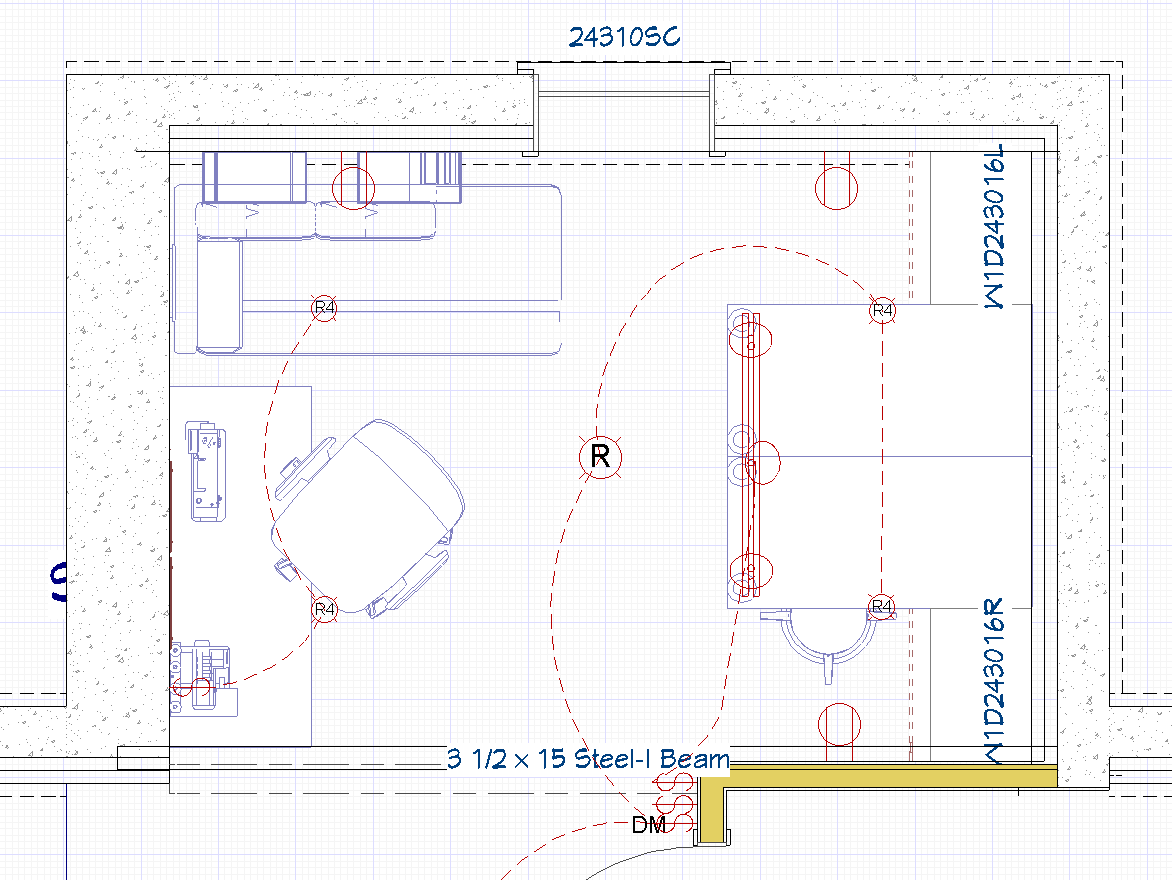
The room itself is simple really, it's a rectangle. It still has a few constraints though and it's important to plan around them as it influences what can fit. It's a small space measuring approximately 11' 7" x 8'. There's a wide opening into the utility area separated by a beam (overhead obstruction), a window, and outlets to plan around.
I have taught myself how to use the Chief Architect design software for all my planning so I started by modeling the current state of the room with all of these measurements, openings, outlets, and switches. I took out my laser measure and tape measure to get all the measurements as close as I could.
These constraints will influence the placement of any furnishings so it's very important to get an accurate idea of the space.
Note: I am a visual person and I like using software to see a mockup in 3D but I'm positive many of you would not use professional design software for your home projects. Still, if you're interested, I use Home Designer from Chief Architect. All of this planning and design can be done using graph paper and a pencil too!


How did we place furniture and fixtures?
Given the space constraints and list of must-haves and nice-to-haves I could start choosing furniture. This is where your budget, style, and personal approach come into play.
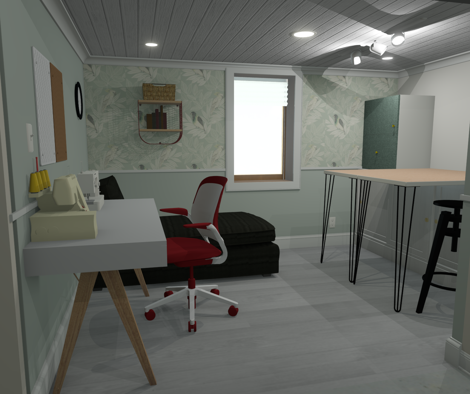
The first thing we did was to look at the physical space in person. You want to get a sense of how you'll move around the room in practice. Because of the open doorway (with the steal beam, there's no wall there), I thought storage and cabinets should go against the right wall. It makes it easier to get that "built in" look. That meant her desk and a reading nook would be on the left wall.
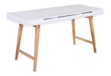
Choosing a desk
The measurements of the room dictated what pieces I could look for. For a desk, I knew I wanted at least 48" and no more than 55 or 56". That length ruled out a majority of computer desks and instead lends itself more to writing desks. I also liked writing desks because they were not as deep which saved space in a small room.
I ended up looking at these two desks: the IKEA MICKE desk and the Elle Decor Giselle writing desk.

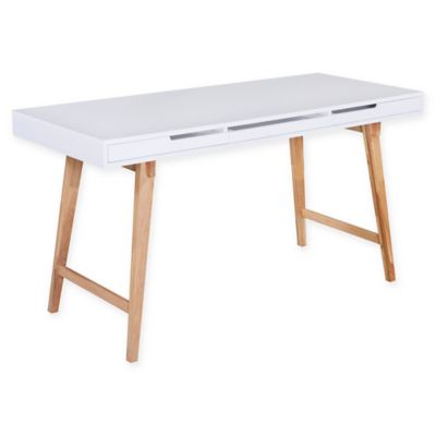
Both fit in the space and matched the style and to be honest, I had initially planned on the MICKE but it's popular and out-of-stock everywhere. The Giselle was well-reviewed, good on all the measurements, and I purchased it on Bed, Bath, & Beyond and used the first-timer 20% coupon to get a pretty good deal on it.
Figuring out the work table
The biggest challenge was the work table. It has to be sizable and she has to be able to stand and move around most of it. We discovered right away we couldn't fit a table in the middle of the room. Instead, I thought about putting it against the wall. I was inspired by a Pinterest pin I saw of putting two IKEA tabletops together.

Given that, I measured the room and discovered that two HAVSTA cabinets could fit side-by-side perfectly (at 94") in the space against the wall. The tabletops could then sit right on top, at a comfortable 35" off the ground.

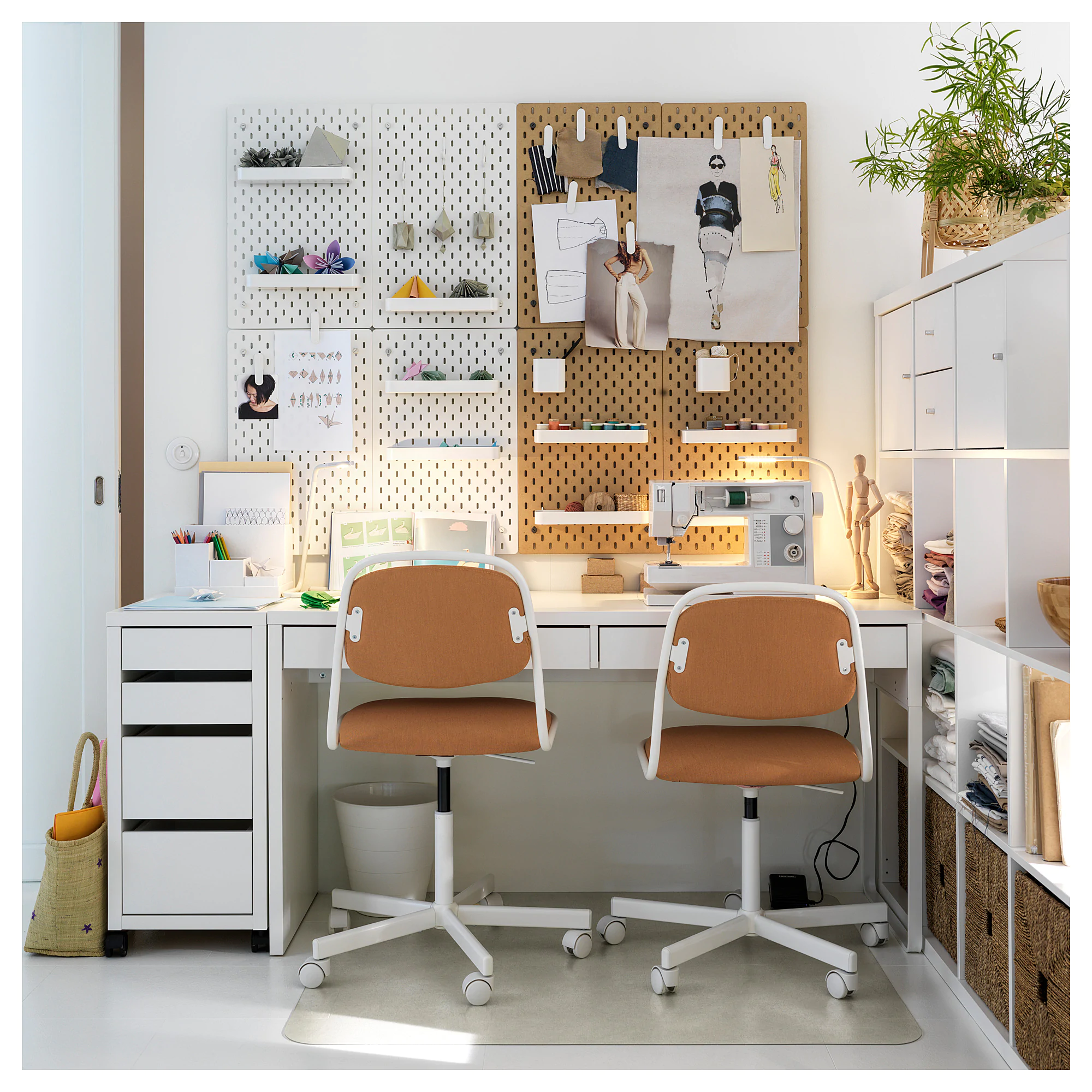
The sewing room over at Kama Sewtra actually looks very similar to our final design mockup! 😍
 Reagan
I originally loved the idea of using cabinets at the end of the table to hold it up. Unfortunately, that didn't leave enough room for stools underneath without it being super cramped because the longer LINNMON table length was too long and would have made the space feel awkward. Instead what we did was go with a MICKE file cabinet that has wheels and can be wheeled around her room and stored under the table.

Know when to save money
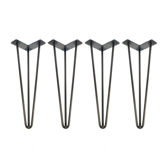
When I was thinking about table tops I did consider custom made ones with beautiful solid wood. However, they were very expensive. When I bought my standing desk I chose Rubberwood and it looks amazing but it came with a price tag. The other thing is that I had to remember what the surface was for. It's a work surface, it's utilitarian. She's going to be cutting on it, moving things around, etc. and scratches are inevitable. I decided to go with IKEA because even if it wore down over time, we can swap it out for <$60.
Instead I opted to go with these custom hairpin legs from Etsy to add some flair (and the IKEA ones were sold out 😒):

The rest goes around the big things
Knowing where the most important pieces go, we could now place other items around them. With the desk on the left and the table against the right wall in the middle, I could find a chair that worked (I chose a chaise lounge) and storage that worked.
Wouldn't you know it but BESTA cabinet frames fit perfectly next to the LINNMON tabletops so I planned to fasten them to the top of the HAVSTA base cabinets. I stacked two frames on top of each other on each side of the table.

The chaise lounge would go next to the desk and couldn't interfere with the window or desk. That meant it would be a left-arm chaise. This would give Cassie a comfortable space to read or take a little nap!
The placement plan
With all the furniture picked out, I was able to bring them into the design program to make sure all the measurements worked out okay.
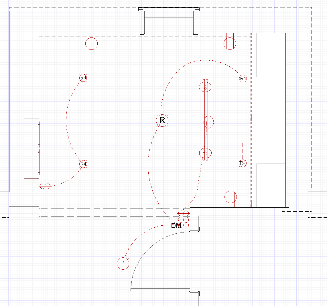
The lighting plan
After placing all the furnishings, I could visualize how the lighting configuration could work.
I used some rules of thumb when placing the recessed lights:
- At least 2' away from walls to avoid over-washing
- Lights should be about 4' away from each other
- They should line up in rows and columns
General lighting
Working at the desk or the table should have overhead lighting to make sure Cassie can see everything clearly. I placed two 4" lights above the desk area and reading nook. To balance on the other end of the room I also did the same 4" lights. All of these were inset exactly 2' away from the walls.
In the middle I chose to do a larger 6" recessed light because doing 3 rows of lights was too much I felt. The middle one was also about 4' away from the four other lights and that felt good to me.
Focused lighting
One thing we thought was to use the wall between the storage cabinets above the table as a photo wall for the blog. That meant I should plan for a track light or some other fixture to focus light on the wall for photo shoots. Using a track light would let us customize the lighting if needed to focus exactly where we wanted. Leaving the wall space blank would let us pick and choose what decor to add behind it.
Task lighting
This is up to Cassie but if she wants a little task light for reading or working at the desk, she has that option since there are outlets nearby.
Splitting the lights
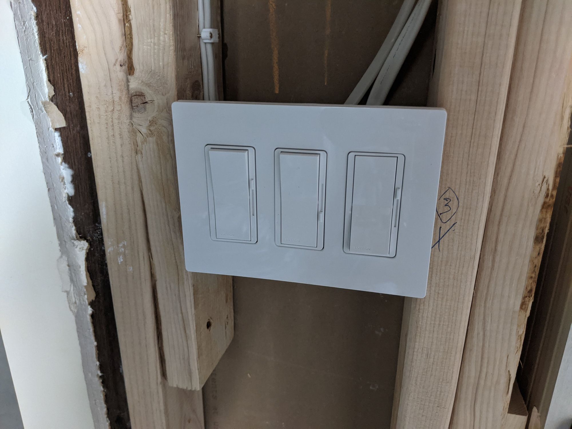
In the room before we remodeled, there was a switch against the left wall which controlled the old light. In my new plan, I decided to swap it with a dimmer switch and let it control the left half of the room:

On the right side, several things were planned. An old light switch already existed to the left of the new utility door and I needed to move it to the right side. With that in mind, I figured I would add a dimmer switch to control the right half of the room (3 lights). Finally, I'd add one more switch for the track light fixture to control it independently. That makes 3 switches for that plate to the right of the door.
Allowing her to control both halves of the room will give us a ton of flexibility for different lighting configurations (and save a little cost, if she only needs one half lit).
Get a design review, if you can
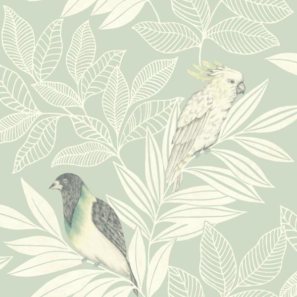
We are fortunate that a close friend decided to change her career to become a fashionable interior designer here in Minneapolis. We all had a Zoom call and I asked her what she thought of the design. I am proud to say the only change she suggested was using the original wallpaper Cassie and I liked with birds. We agreed since we all thought the Moroccan tile one was a little busy. I joked about me being her design intern. Or was I? 🤔
I don't expect you to have a Julia in your friend circle but you can still get advice from a pro. I haven't used it myself but check out Decorist. Since you're reading this and you're a go-getter, you could come prepared with your own mock up!
Mocking it all up!
Throughout this process I had been mocking up the different ideas. We went back and forth a lot on likes/dislikes. I tend to post progress pics on our Instagram so be sure to follow us if you want more "real-time" content 😁
I kept some of them to feature here, to show what the progression ended up like:


Using stock IKEA HAVSTA cabinets for the table was something I decided didn't afford as much space as I thought. That is when I decided to try and place them against the wall (reverse the design) and then it started coming together.


As you can see, I experimented with a chair rail, wainscoting, and different furnishings for the reading nook. We did really like the Bambi Craft Tower but it didn't make it into the final design.
The Moroccan Tile wallpaper was a favorite for Cassie and I liked it too. However, after our design review we went with another wallpaper we had picked out originally, this Paradise Birds one!

Love it! 😍 The desk isn't exactly the same and neither is the chair... but the rest? Basically the same as what I planned with IKEA models I got from SketchUp's 3D warehouse. These models can be imported into a lot of different design software like the I use called Home Designer.
Now the real question is: how closely will the final result match the design? Stay tuned!
👉 Be sure to follow this project on Instagram for progress pics, live streams, and to see it come together ahead of the blog!
Next up? Permits, demo, and electrical rough-in!
Kamran